Haven Design System
Design System Creation, Maintenance, & Advocacy
Haven Design System (HDS) is designed in Figma and documented in both Figma and Storybook for designers and frontend engineers, respectively.
Company
Haven Technologies
Year
2021 & Ongoing
Role
Senior Product Design (Design Systems)
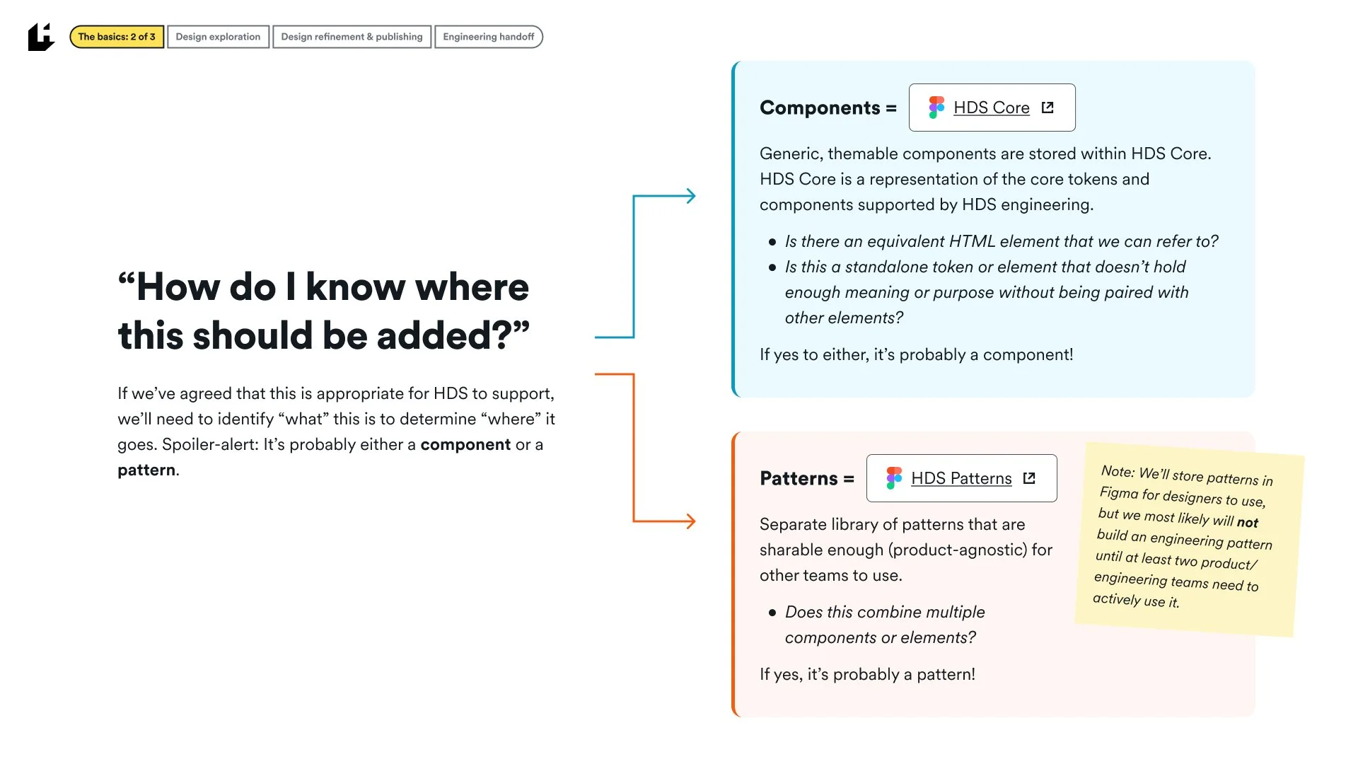
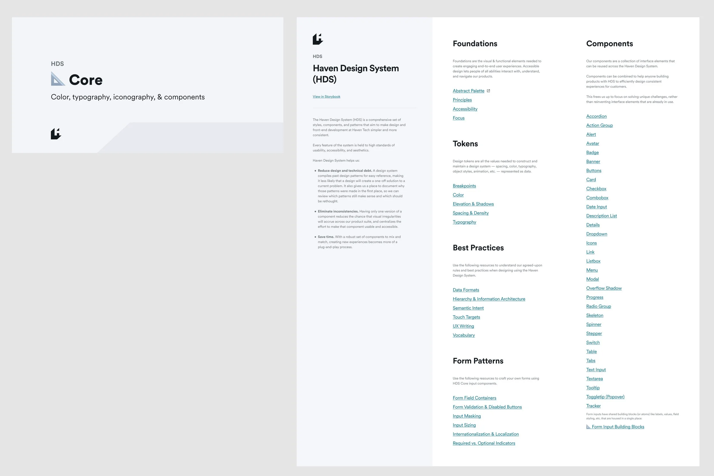
HDS Core Library
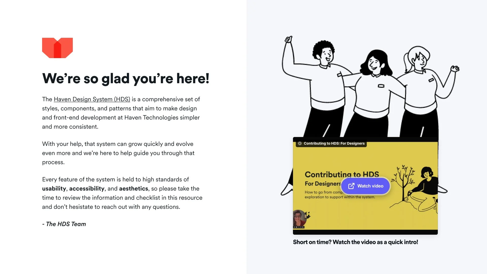
The Haven Design System (HDS) is a comprehensive set of styles, components, and patterns that aim to make design and front-end development at Haven Tech simpler and more consistent. Every feature of the system is held to high standards of usability, accessibility, and aesthetics.
The core Figma library covers:
Principles (Crafted, Considerate, Empowering, Trustworthy, Efficient, and Familiar)
Foundations (Color tokens, typography tokens, icons, spacing tokens, breakpoints & grid layout, elevation & shadows, and focus states)
Best practices (Accessibility, data formats, error & validation messaging, supplementary messaging, hierarchy & IA, vocabulary, and semantic intent guidance)
Components (Accordions, alerts, banners, buttons, cards, etc.)
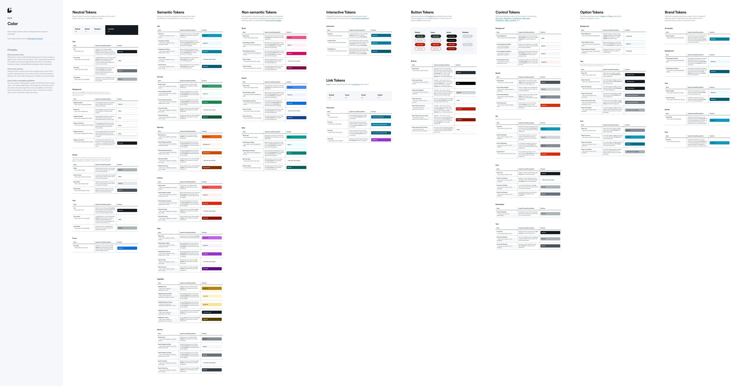
Abstract color palette
Our abstract palette adheres to WCAG 2.1 Level AA contrast checks across key color combinations to ensure a “safe” palette for core HDS components to choose from.
All tones 60+ pass 4.5:1 contrast checks with inverted white text
All tones 50 and below pass 4.5:1 contrast checks with default Slate 100 text
All tones +/- 40 pass 3:1 contrast checks in the same hue*
All tones +/- 60 pass 4.5:1 contrast checks in the same hue*
* Neutrals (Sand, Gray, and Slate) pass contrast checks across all hues
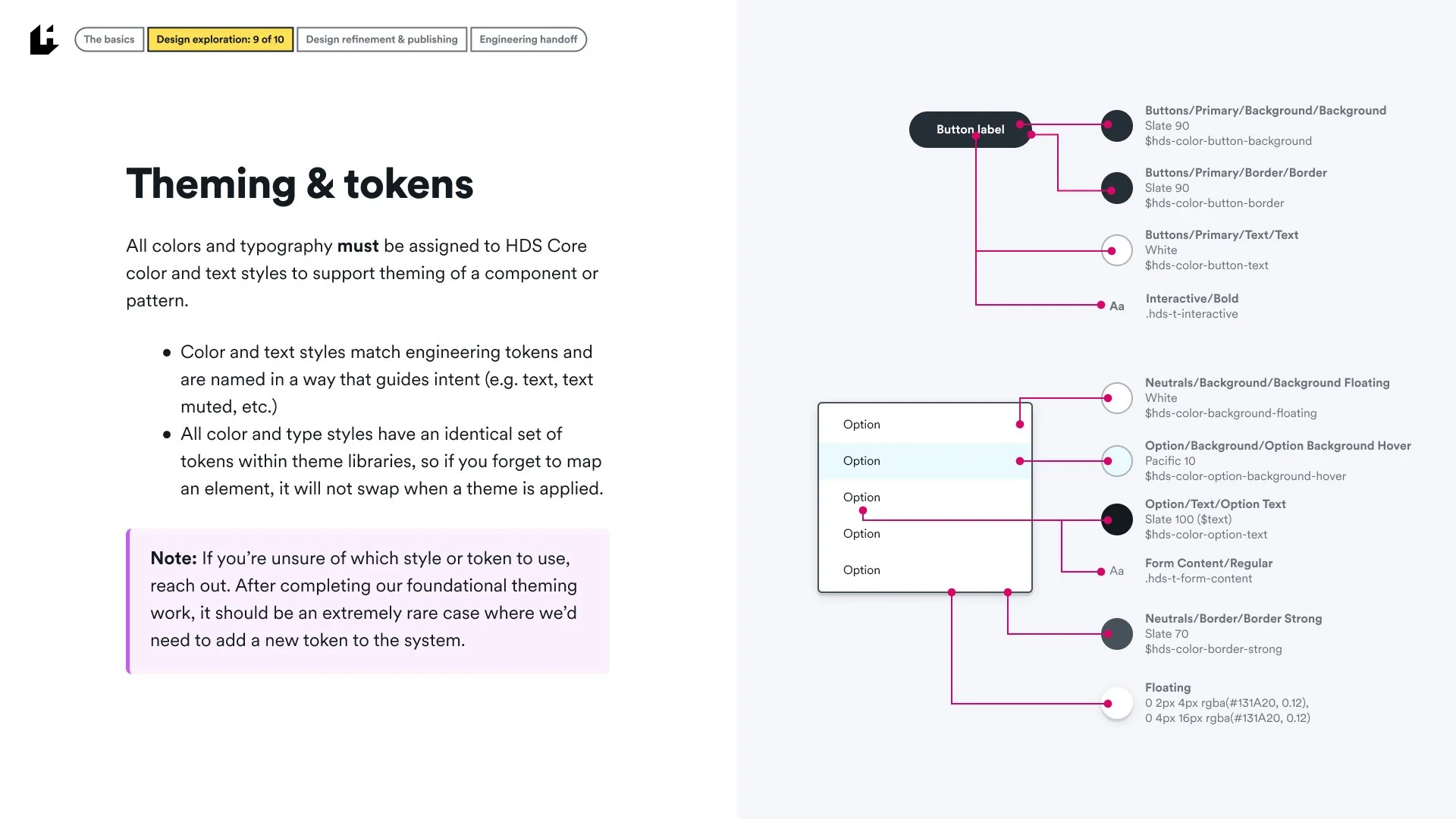
Abstract colors are then assigned to color tokens that are named “with intent”, signifying colors for text, text-muted, text-disabled, all the way through semantic, non-semantic, interactive, button, control, option, and brand tokens.
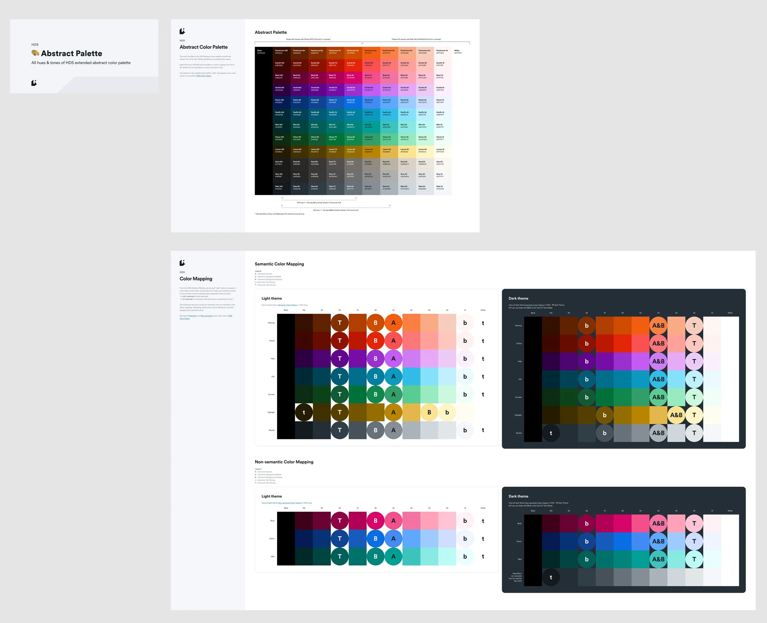
Color tokens
Color tokens are named “with intent” based on a predefined naming syntax pattern, all done in close collaboration with engineering.
Rather than defining tokens like gray-light, gray-medium, gray-dark, color supports the purpose of the content, communicating the hierarchy of information, interactive states, and semantic and non-semantic elements to make color choices easy and predictable for design and engineering.
Examples of token naming include: —hds-color-text, —hds-color-text-muted, —hds-color-semantic-critical-accent, —hds-color-link, —hds-color-button-accent, etc.
The color system is carefully designed to comply with WCAG 2.1 AA contrast ratios.
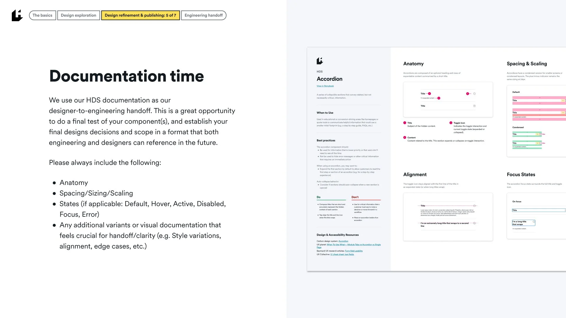
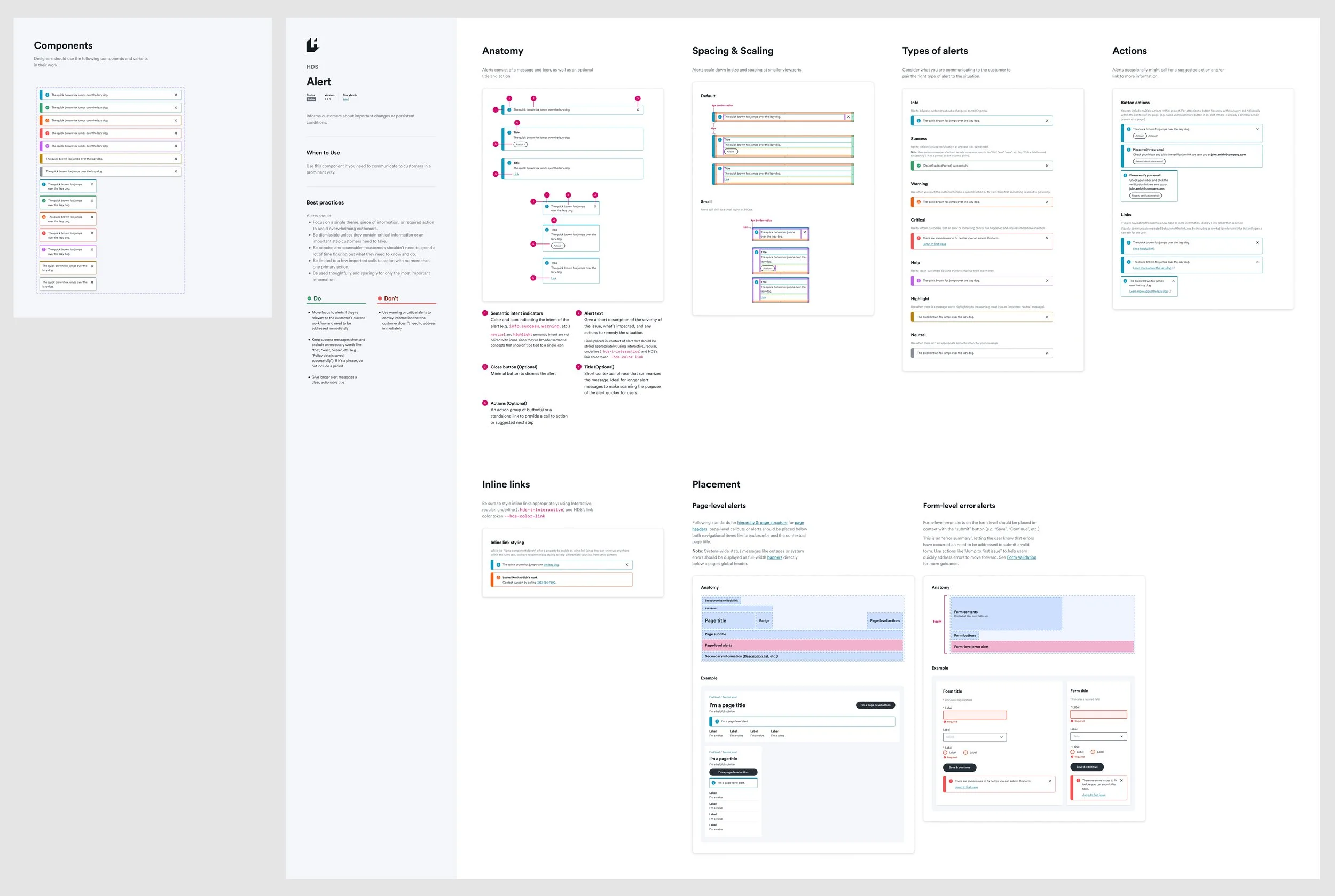
Component documentation
All HDS components are crafted for designer ease-of-use, with handoff to the HDS team’s frontend engineering in mind.
Documentation covers:
Components and subcomponents
Status, Version, and link to Storybook documentation
Definition, “When to use”, and best practices
Anatomy, spacing, and density
Interactive states, semantic variants
Expected placement within our page structure best practices
Accessibility notes and visual regression testing
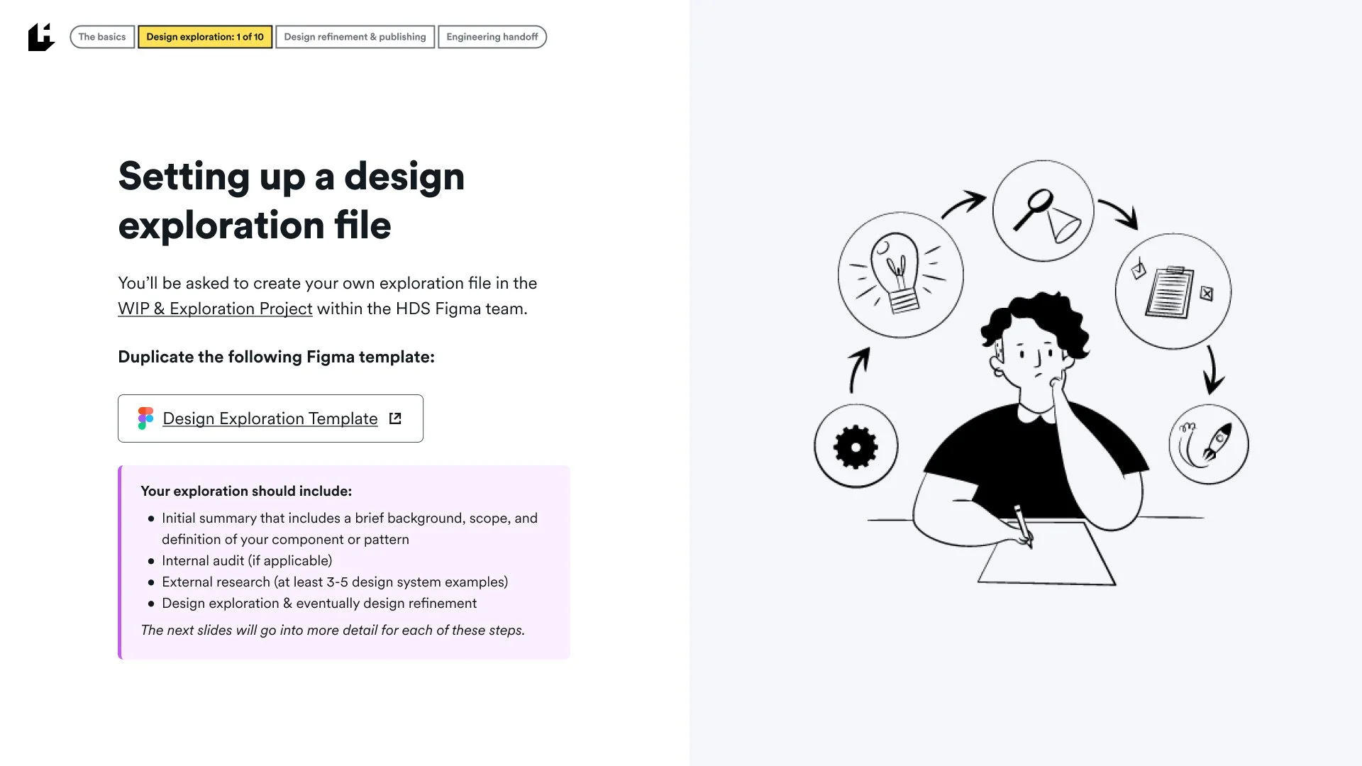
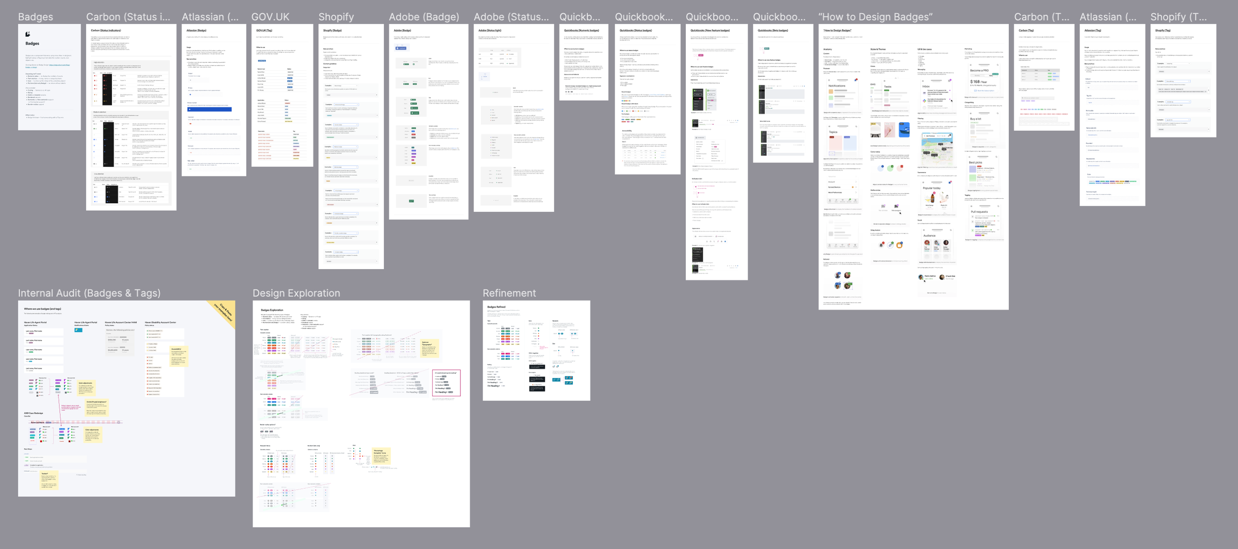
Component research, audits, and exploration
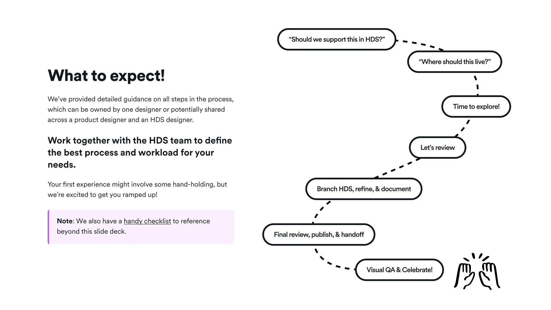
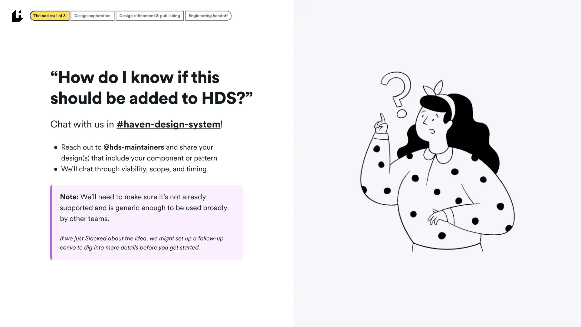
All new components and patterns are brought through a defined process to ensure well-rounded, reusable elements for designers and engineers to use across products. This process includes
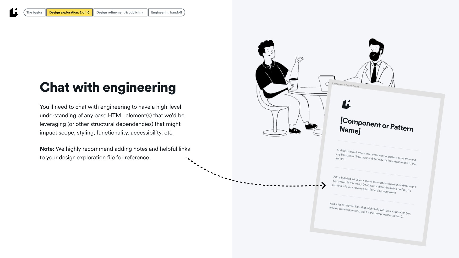
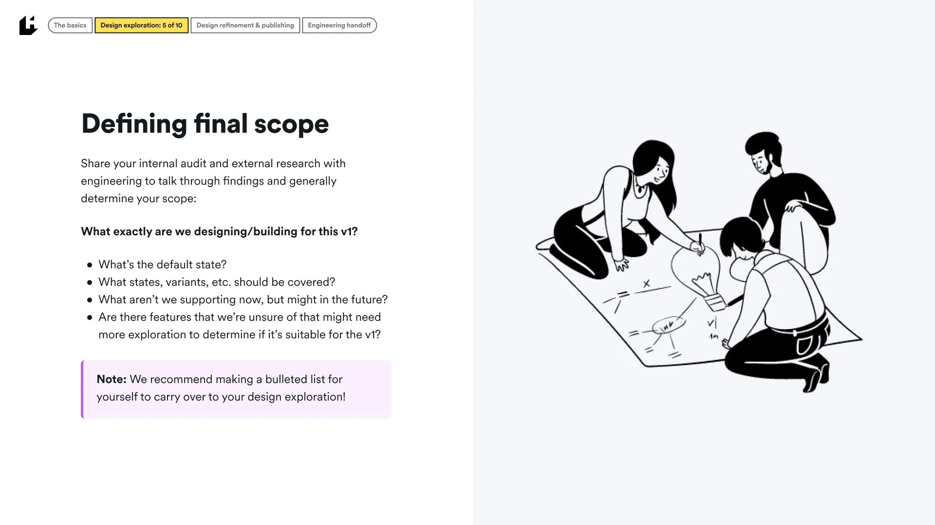
Initial design and engineering scope and timing conversations
High-level definition of the component or pattern
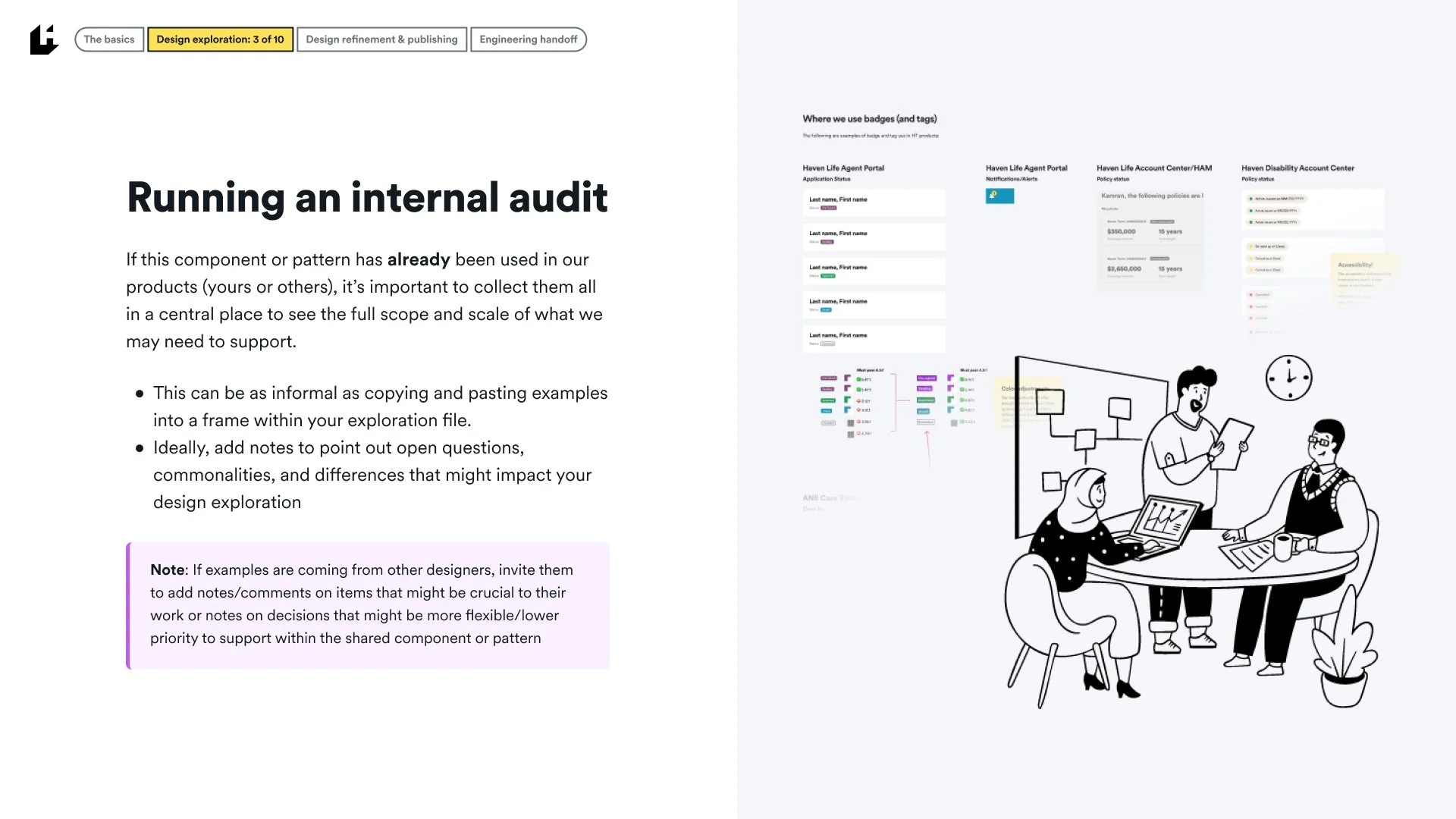
Internal auditing of any use of the element across existing products
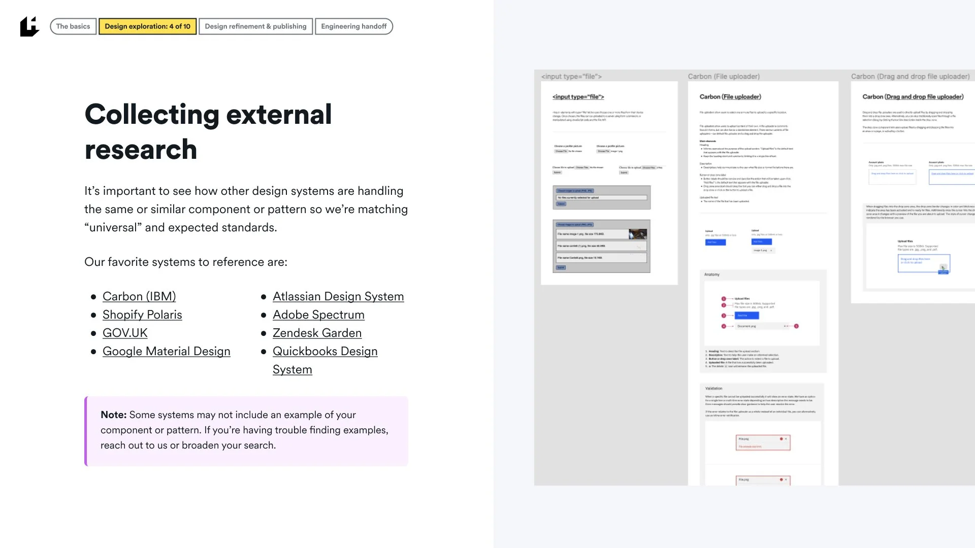
External research across key design systems and other resources
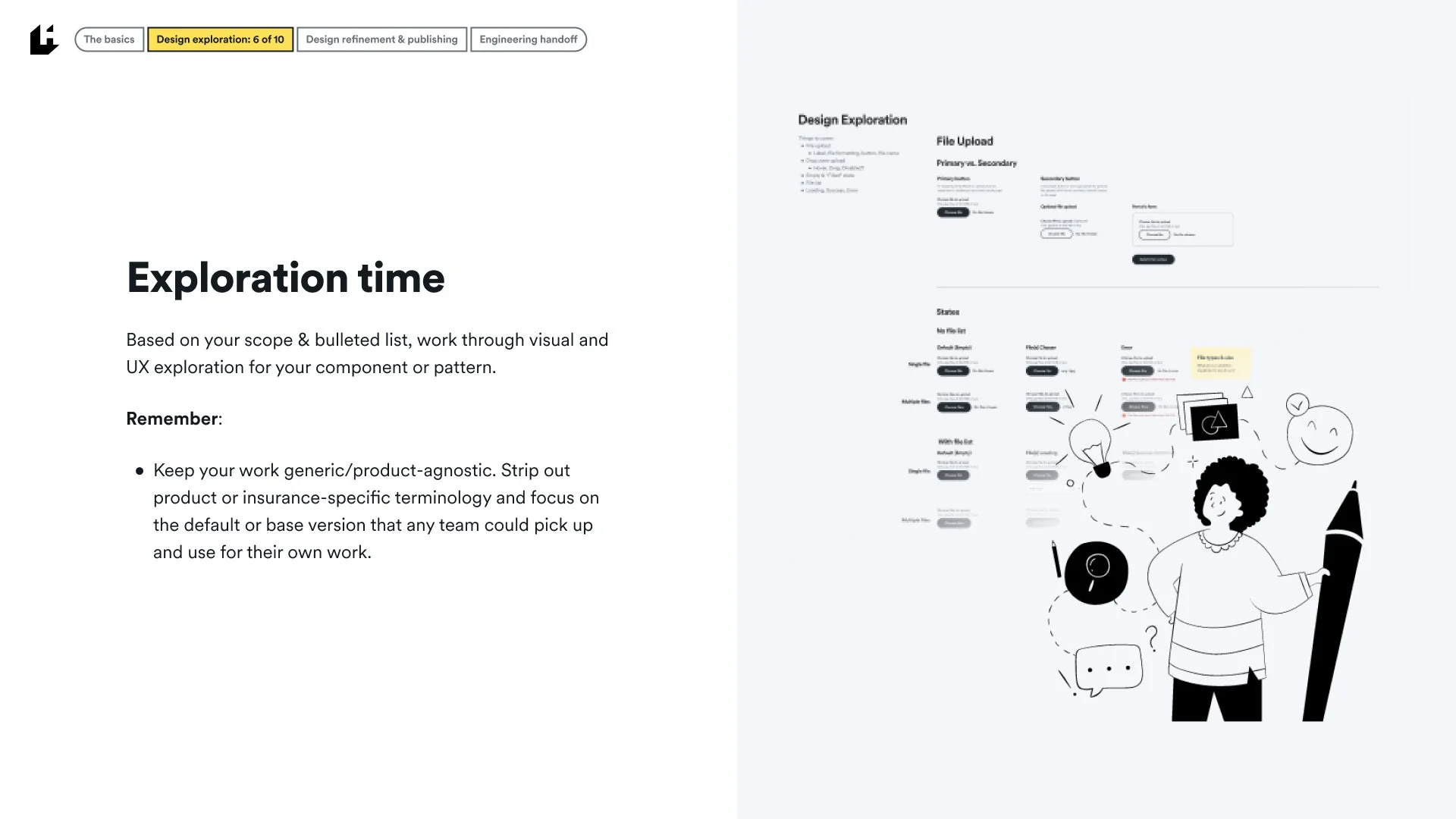
Design exploration & note-taking of open questions
Review and refinement
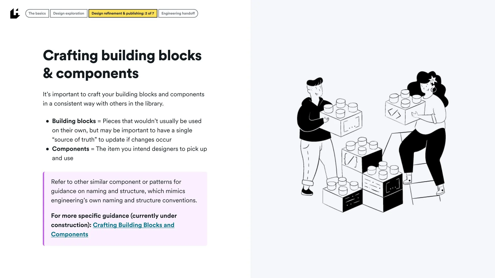
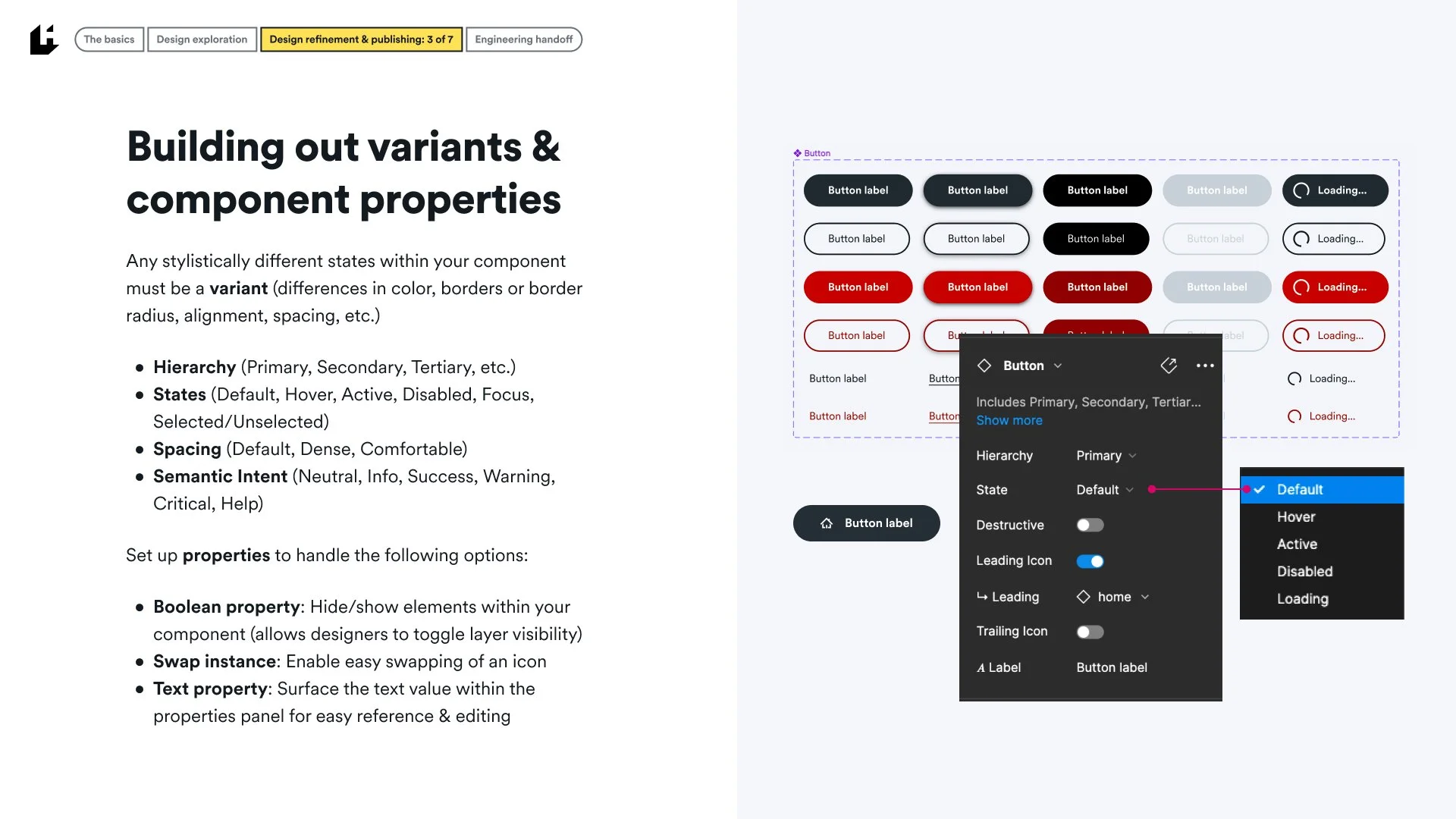
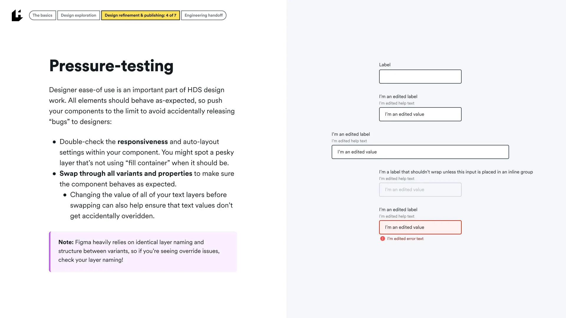
Designer ease-of-use
Of the smaller details of the system, I’m most proud of the ease-of-use improvements I’ve made to all components by leveraging Figma properties to mimic our own engineering properties:
Variants & Properties
Hierarchy (Primary, Secondary, Tertiary, etc.)
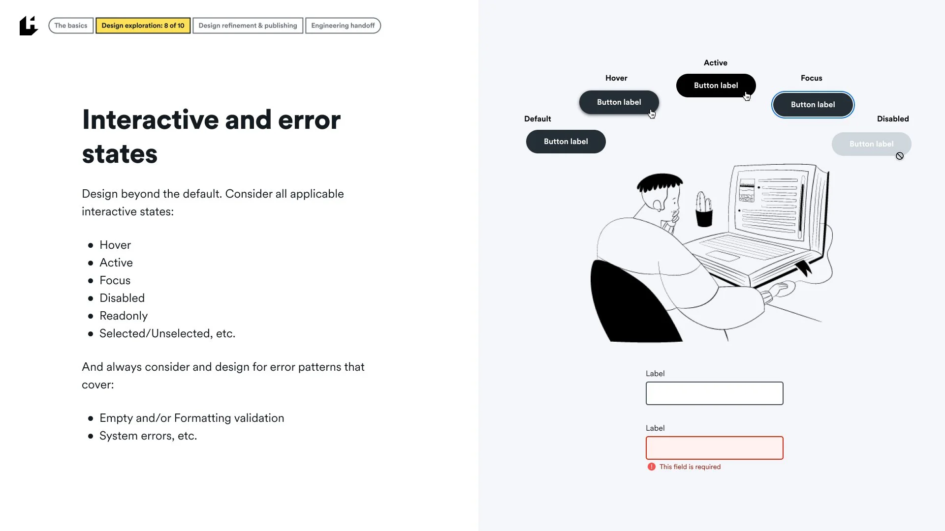
States (Default, Hover, Active, Disabled, Focus, Selected/Unselected)
Spacing (Default, Dense, Comfortable)
Semantic Intent (Neutral, Info, Success, Warning, Critical, Help)
Boolean property: Allows designers to toggle layer visibility
Swap instance: Enable easy swapping of an icon
Text property: Surface the text value directly within the properties panel
Designers are able to pull components from the library and have a wide range of customization options all directly within their properties panel. It’s a huge time-saver and makes engineering handoff that much easier since our front-end team can directly see how a component should be translated into the options and variants within their own work.
Accessibility documentation
While our Storybook documentation covers the technical side of accessibility requirements and considerations, our Figma documentation also includes designer-specific notes to keep accessibility top-of-mind when using HDS components.
Documentation and visual examples cover:
Keyboard interactions & tab order
Heading levels & hierarchy
Color contrast
Context
etc.
We plan to expand this documentation to cover inclusivity-specific notes, especially as we grow our library of more complex patterns and page templates.
Theming
With theming as a major 2022 goal of our design system, our focus on lightweight, but powerful theming capabilities of the system was key. By leveraging our color token system, we’re able to easily swap colors assigned to specific tokens to generate new themes for internal use or client use. Below is an example of our standard Light theme and an alternative Dark theme (other more client-specific themes are in our Themes Library).
Patterns
Beyond the core tokens and components of the system, HDS has quickly become a centralized resource for more specific or complex design patterns to promote and ensure consistency, scalability, and accessibility across the platform. Each pattern runs through the same process of research, ideation, testing, and refinement before being documented and published within the Patterns library.
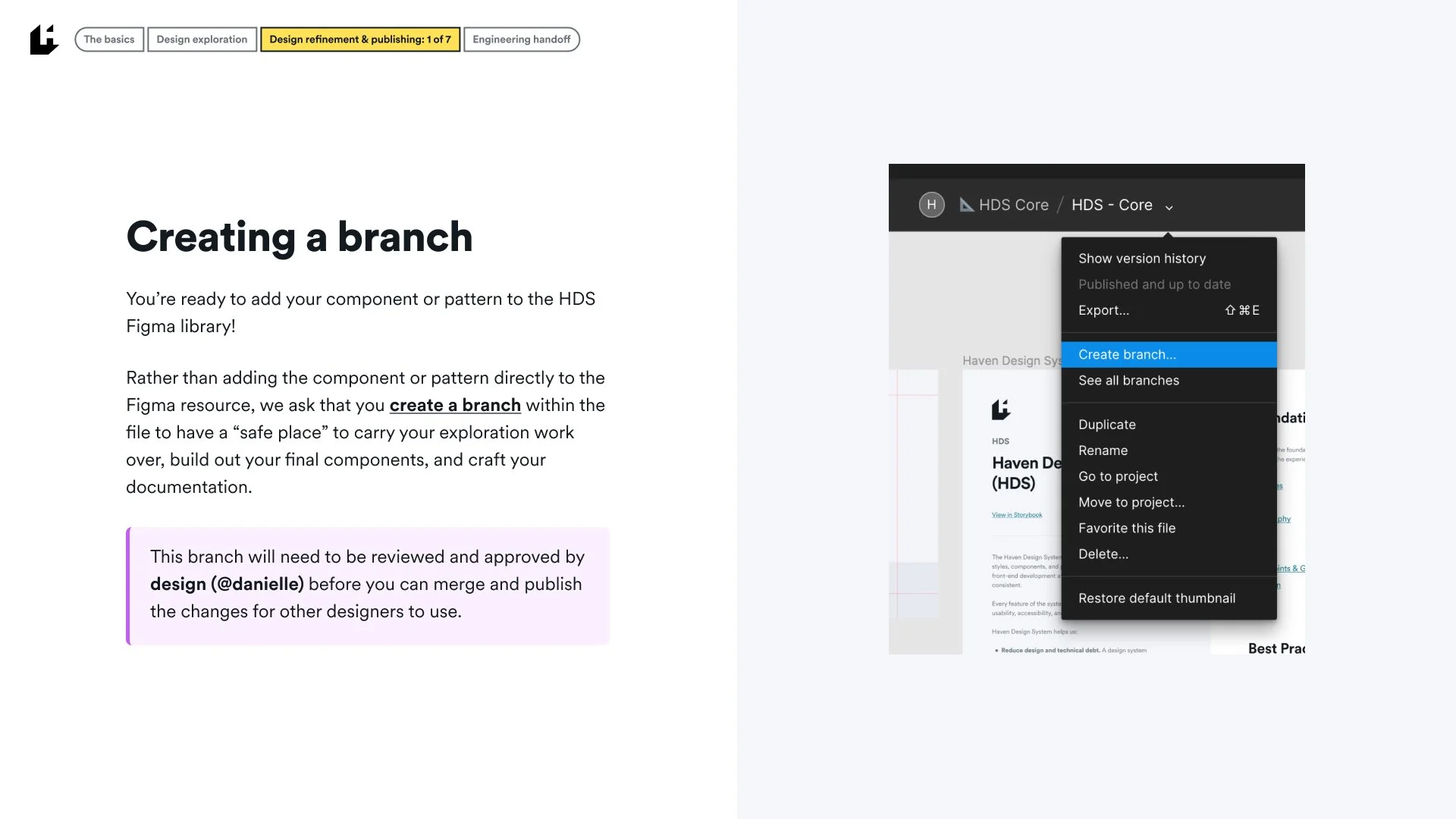
Contributing to the Haven Design System
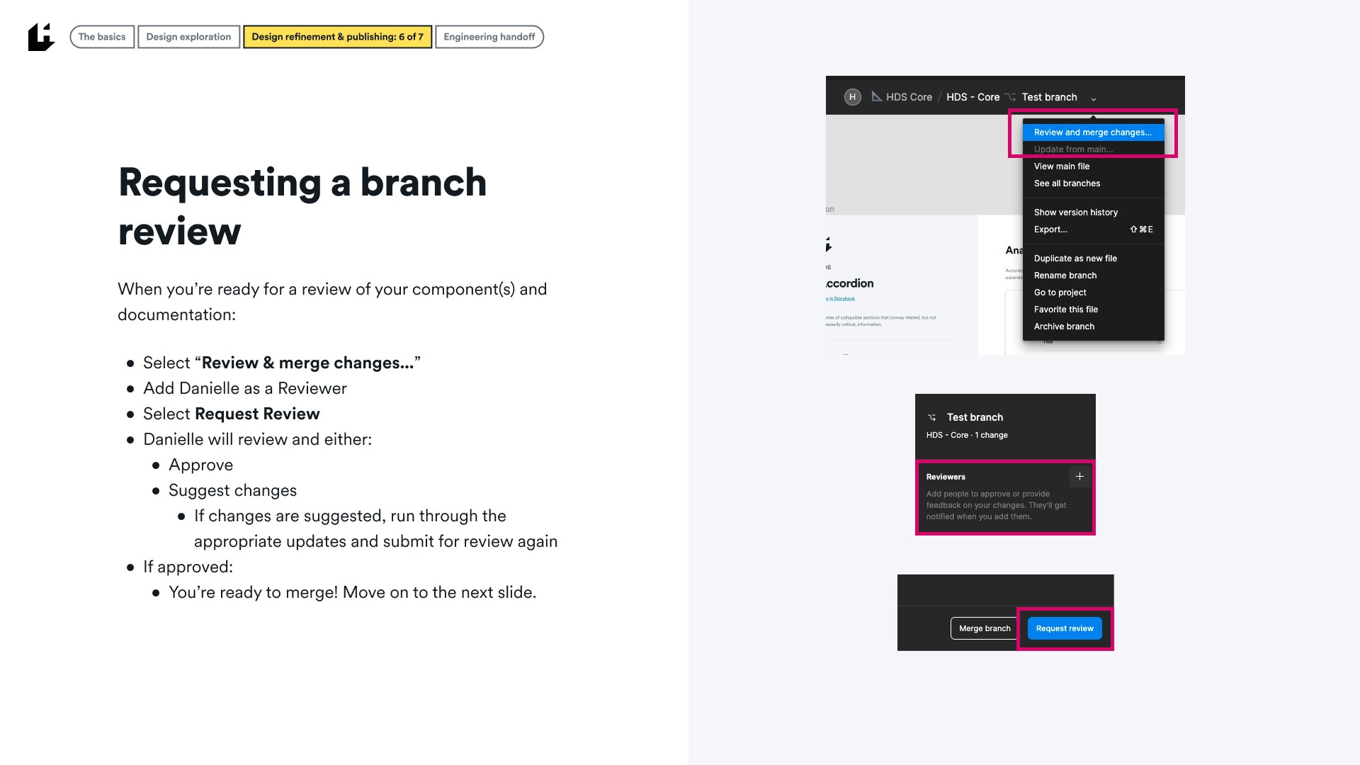
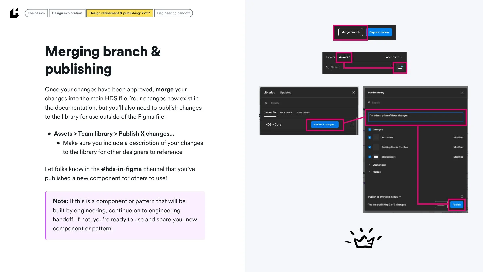
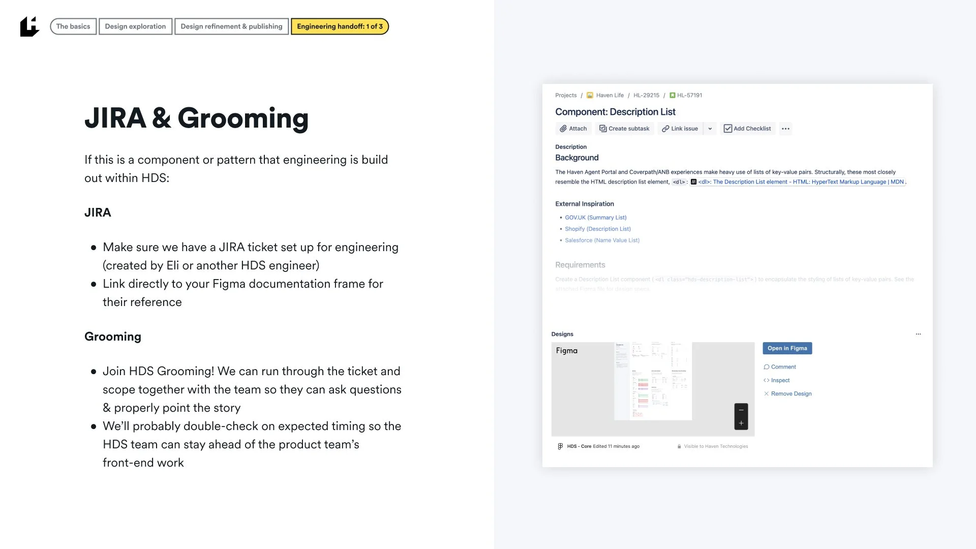
In Q3 of 2022, we opened the door to other designers contributing directly to the system as we see more momentum in the SaaS design space. The following is a guiding resource for any designer interested in making direct contributions to the Figma library and additional handoff to engineering.